This one of that rare kind of project in which you are given the chance to create an entire new identity. Besides that, we were very lucky to have a very good client which have contributed so much for the good results you will see here.
Boa Gula, is new company (launched last month) which produces health frozen food, elaborated by a Chef and planned to fulfill all main kinds of diet needs, based in Sao Paulo - Brazil.
The NAMING
As usual in this kind of project, before reaching the final name, we have produced four long lists. But the choice could not be better:
As usual in this kind of project, before reaching the final name, we have produced four long lists. But the choice could not be better:
Boa Gula.
The concept of the name is to convey the idea of a healthy meal which you can enjoy without fear, because they are carefully crafted by a Chef (Izabela Braga) who takes care to offer dishes with adequate levels of nutrients with very high quality (as opposed to the restrictive diets we all know).
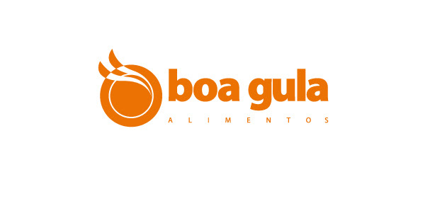
The symbol
The symbol was right from the first time, our the intention was to refer to the memory of the meal put on the table, a few moments before being tasted, with the plate viewed from above and with that "little smoke" and that aroma that sharpens the senses and increases the appetite.
The logo, as a whole, was conceived to convey friendliness and cheerfulness with a high energy so that the observer could feel better and energized just by seeing the logo.

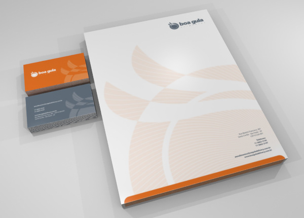
The stationery
Through the stationery we want to transmit a professional and trustable company image and thats why we chose a dark gray as the corporative business color.
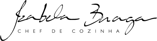
Endorsement signature
Boa Gula executives wanted her Chef's signature to become an endorsement brand so we gave them this one.
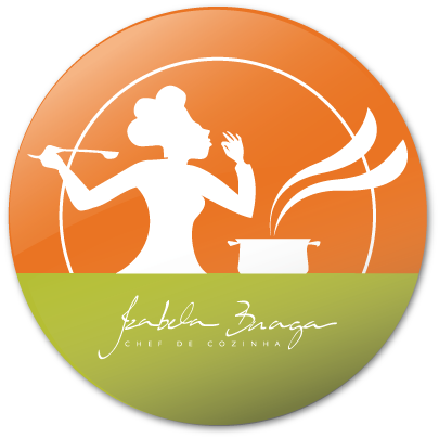
The Chef's Badge
From the Chef's signature came out this badge for more informal uses.
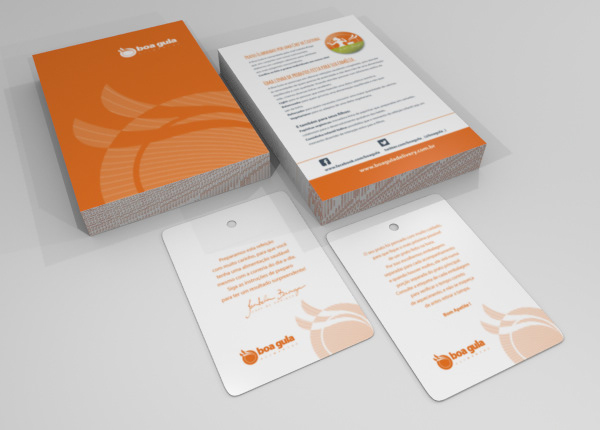
For the promotional materials we injected a more cheerful look because we needed people to have a good insight of the brand.