A Quituteira - Logotype Design
For this project, the client left us with some predefined points which were:
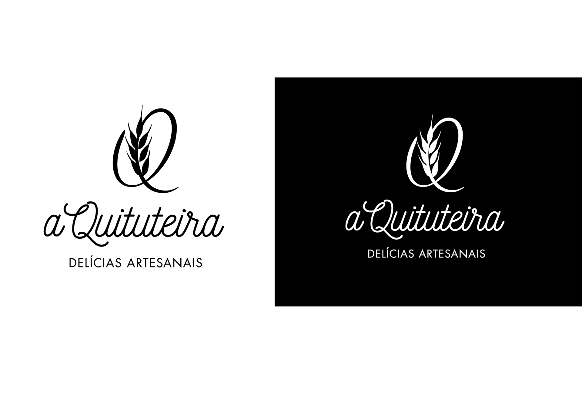
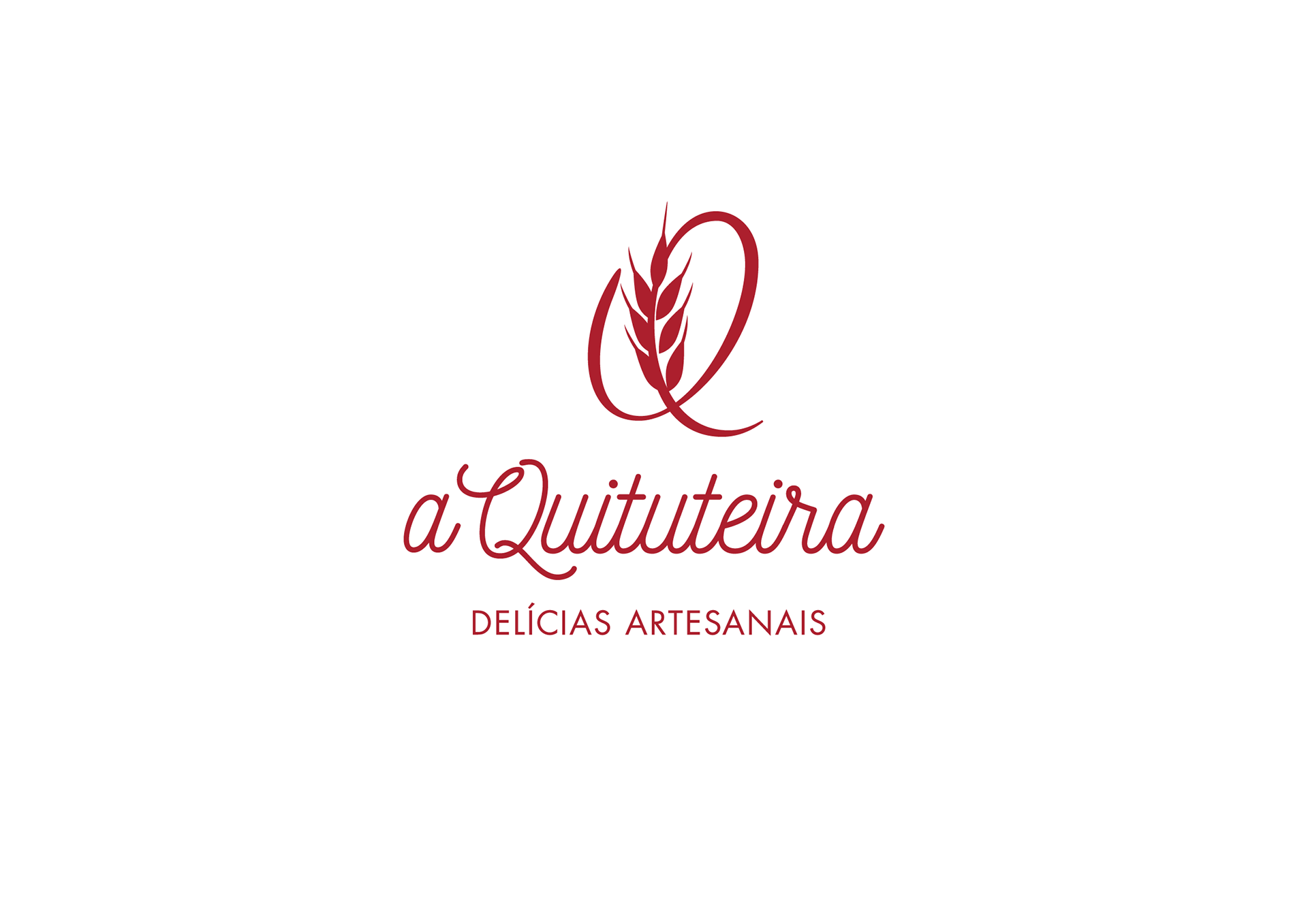
1. she wanted the brand to have the possibility to be applied as a monogram;
1. she wanted the brand to have the possibility to be applied as a monogram;
2. she wanted a handmade like typeface.
"A Quituteira" was going to be a small but elegant and charming bakery in the south of Minas Gerais - Brazil, so despite all the preliminary research I made, looking for out of the standards symbols, we decided to honor the history of the main element in the food industry, especially in the bread making history: the wheat.
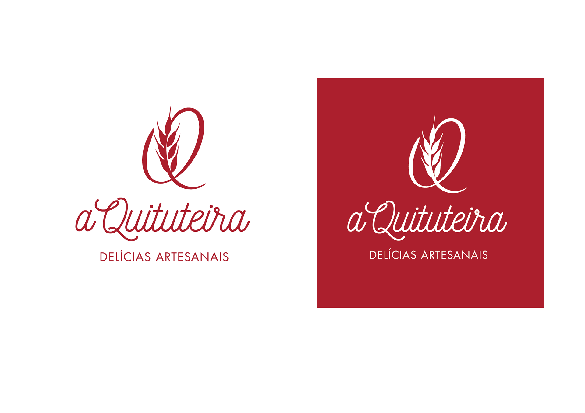
So, all I have done was to build an initial letter "Q" and embed the wheat in it in a way that could build an elegant and graceful symbol that could be used alone. And for the complete version of the logotype, I selected a manuscript typeface which matches the initial "Q" inclination angle with the same elegance and delicacy.