I think every designer must pass through the experience of designing something for a non-profit organization. And we were still waiting for a a chance when Dr. Alonso R. Fuentes Filho called me, inviting me to design a logo and a website for his humanitarian project which would be called "Mão do Mundo - Fisioterapia Humanitária" (Hands of the World - Humanitarian Physiotherapy).
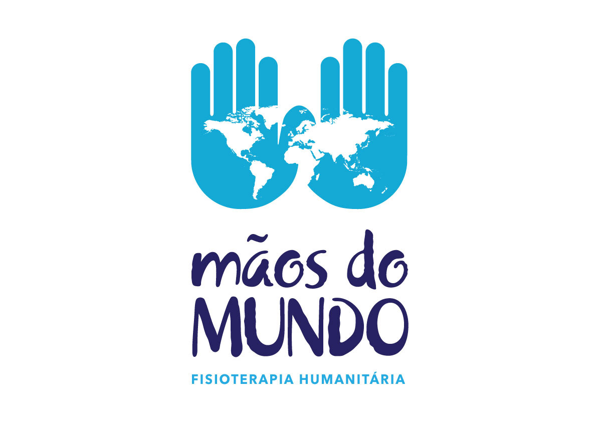
So we created this logo which is meant to convey a clear and quick message of what the organization stands for. Still it has to be trustable and friendly and must be adaptable to the rest of the world.
So we created this logo which is meant to convey a clear and quick message of what the organization stands for. Still it has to be trustable and friendly and must be adaptable to the rest of the world.

The open hands position is the most classic position (if we could say so) used by physiotherapists and in this high contrast version of the logo we can clearly see what simble wants to say: the hands of these professionals taking care of the world.
THE WEB SITE
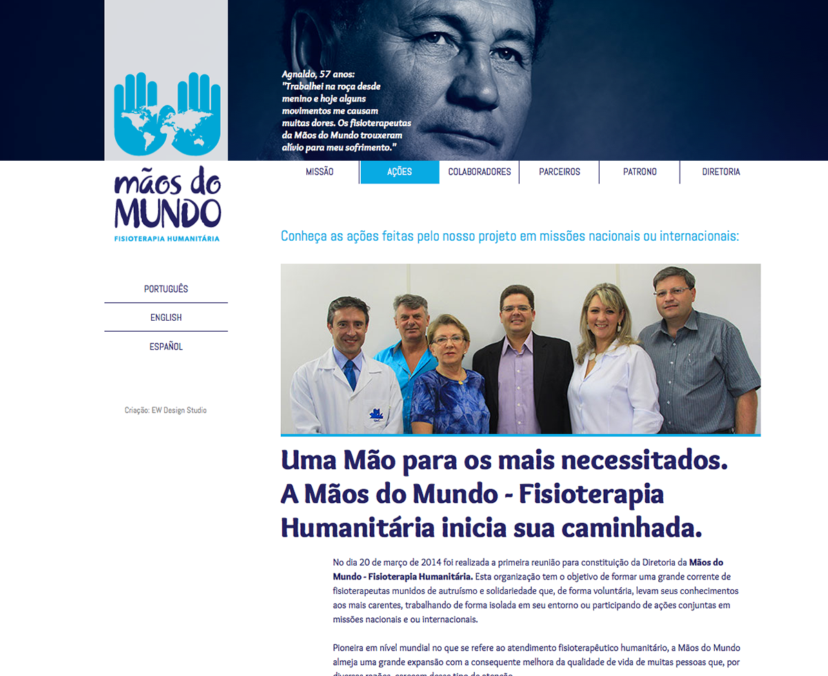
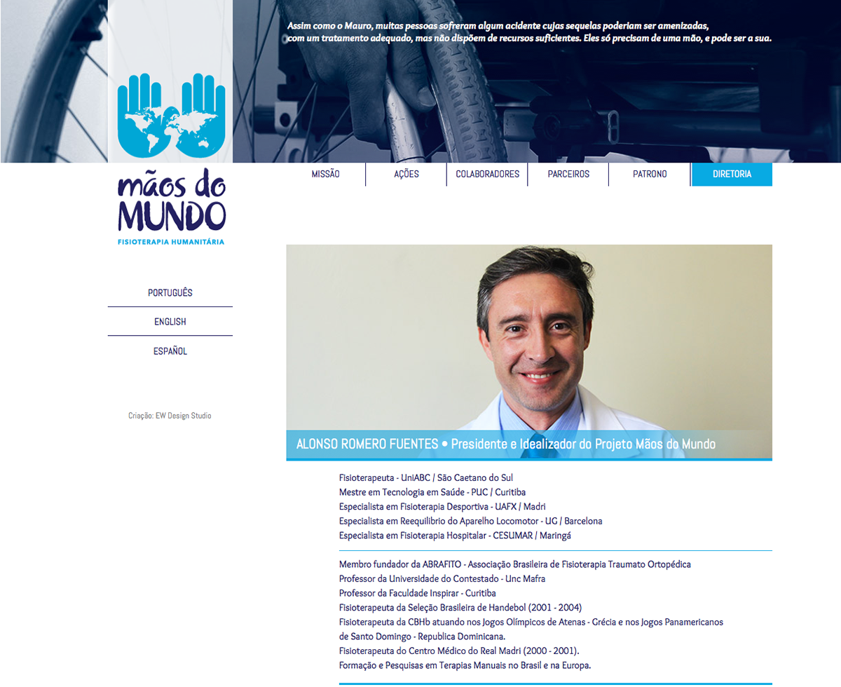
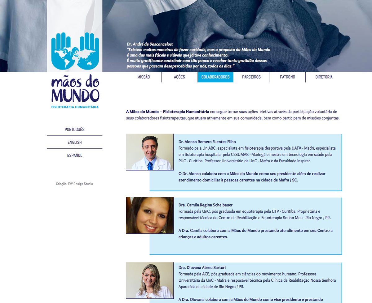
The Web site is the organization only fundraising channel, so it has to touch visitors so that they can feel and understand the cause. To accomplish that we design a web site which was light and clear. The white predominance brings the familiarity with the doctors atmosphere and a kind of peaceful and gooness feel, it also gives a clean and calm readability to the content.
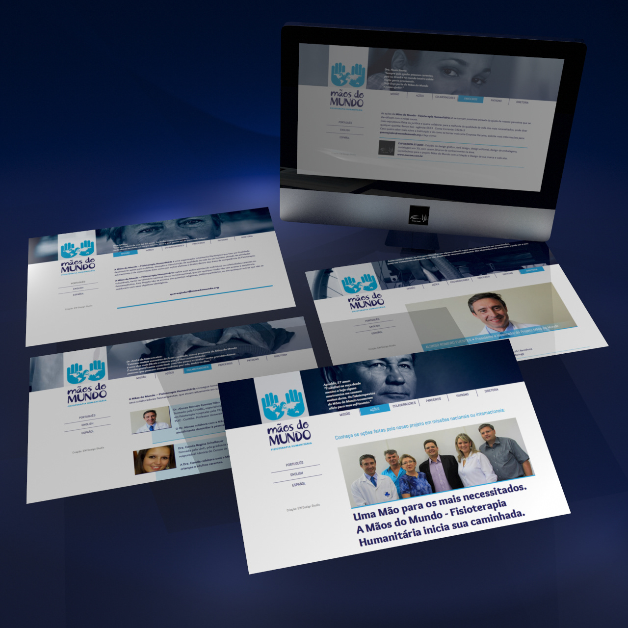
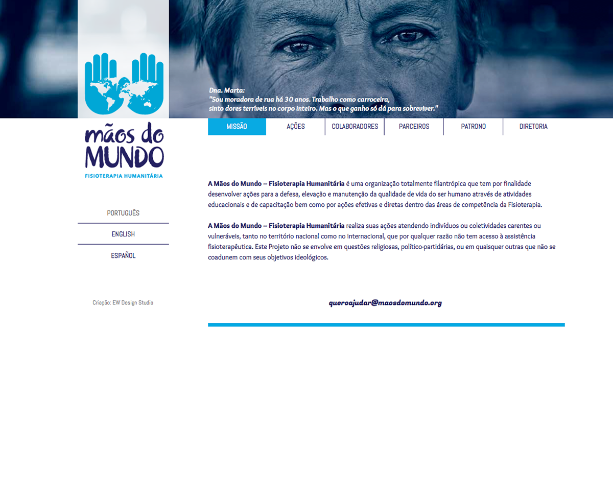
The photographic style holds the function of bringing the emotion and move the potential contributors to action.
Thanks for watching.