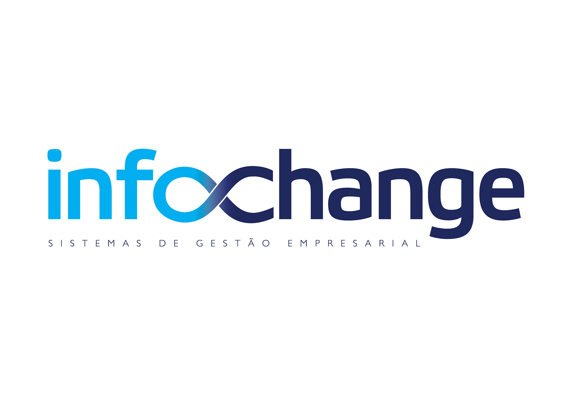
We were commissioned to create a identity for a new IT company which was a joint of two other existing companies, one from Software Development and another from the Comex area.
We came up, as usual, with several ideas for the name and in we played with the idea of merger of the 2 areas (information technology and Exchange of products for importation and exportation).
The resulting name inspired the logo symbology: a broken infinity symbol which conveys the idea of change in the standard view leading to the company's proposal which is to offer the market new ways to do business management. That's why the infinity is divided into to paths opening new possibilities.