
Fazenda Maria da Fé is a small farm located at the South of Minas Gerais State in Brazil. They have been producing a state of the Art Olive Oil which very uncommon in this country due to unfavorable climate and soil conditions and even so they are achieving tremendous results.
After (of course) a long ideation process, I picked up this path.

The concept is to integrate the product in a solid and trustworthy logotype. So I started from the obvious and refined it little by little.
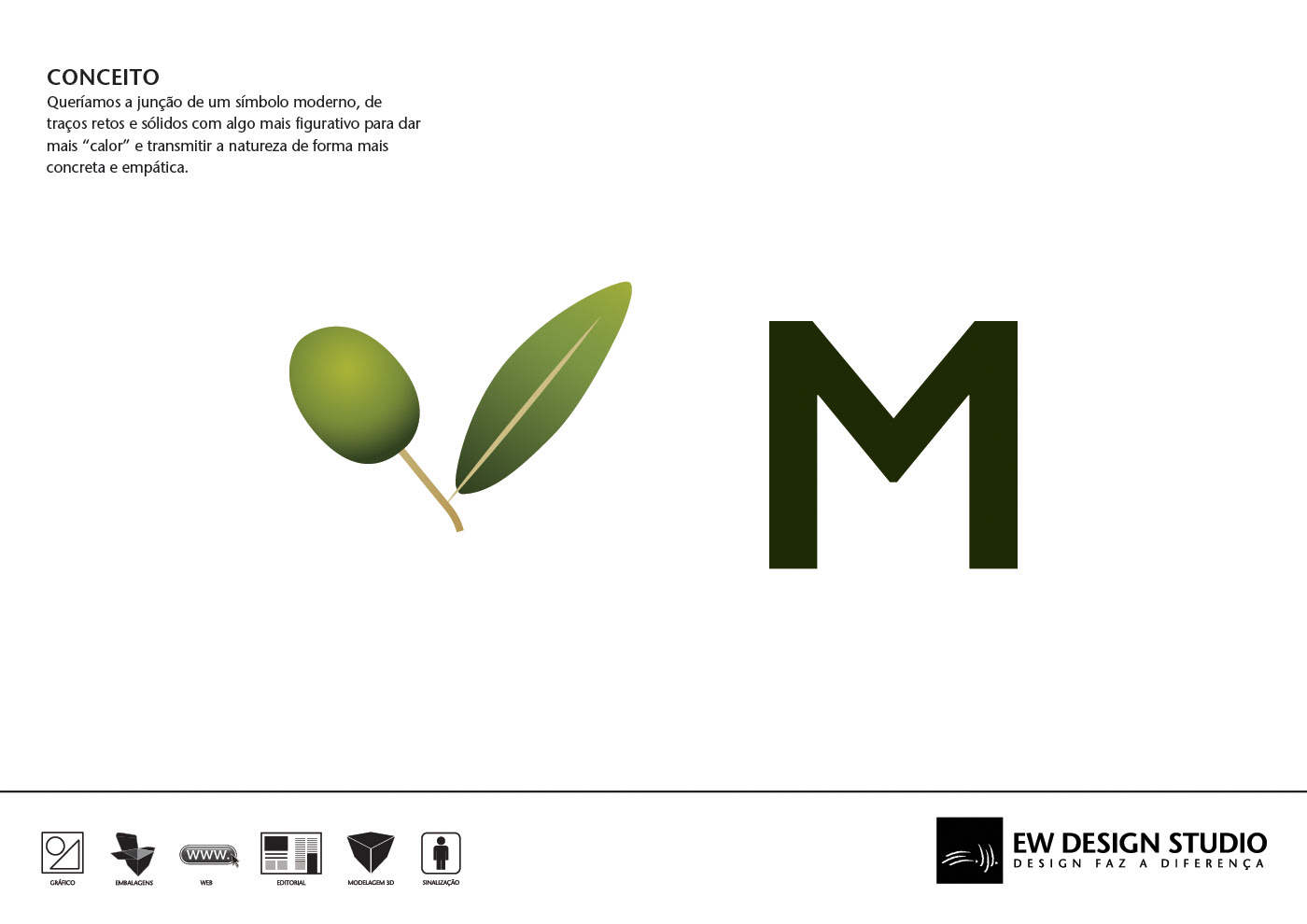

The Olive tree branch and the brand's initial letter form a "V" which I explored.
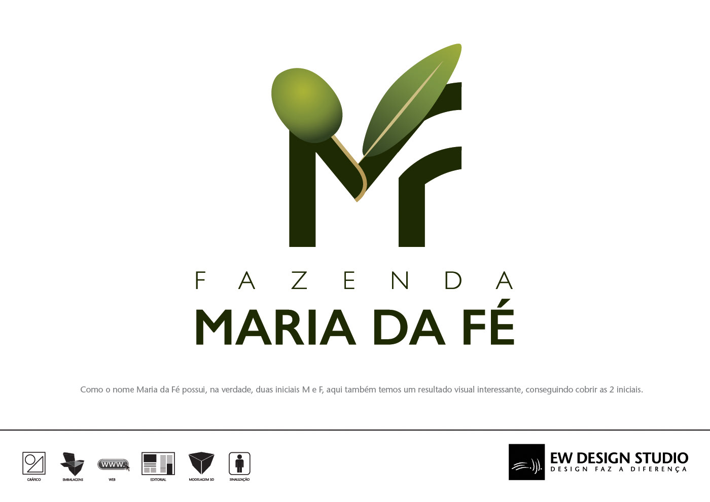
Then I added the second name's capital

Some adjustments were done to forms, color tones and some cleaning was needed so that it could finally become a logotype.